Swami Mosa
A yoga class like no other, Swami Mosa is a parody on the western IG-influencer bastardasation of yoga. Equal parts basic b and self absorbed guru - a mix of mimosas and plenty of satire.
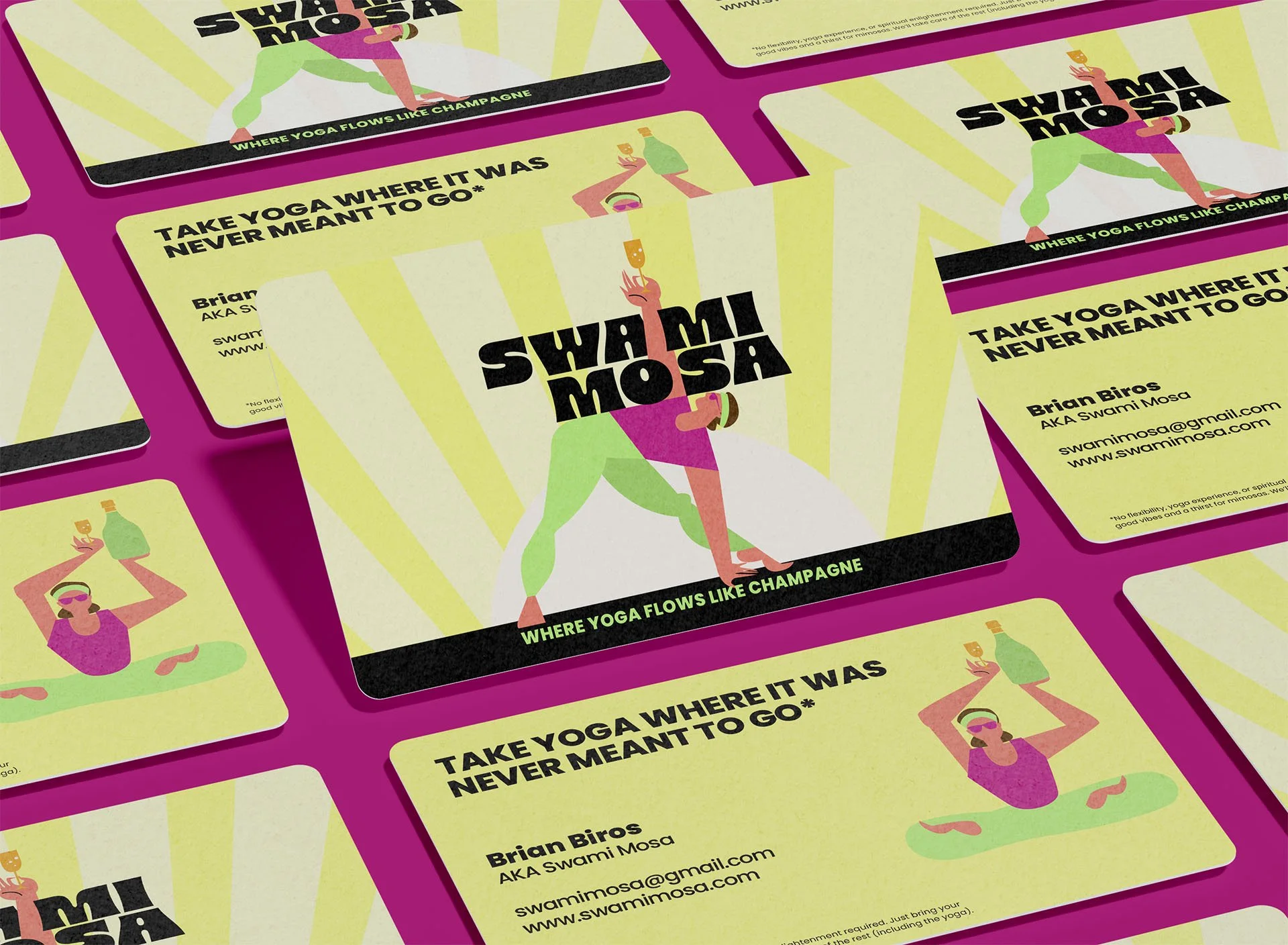
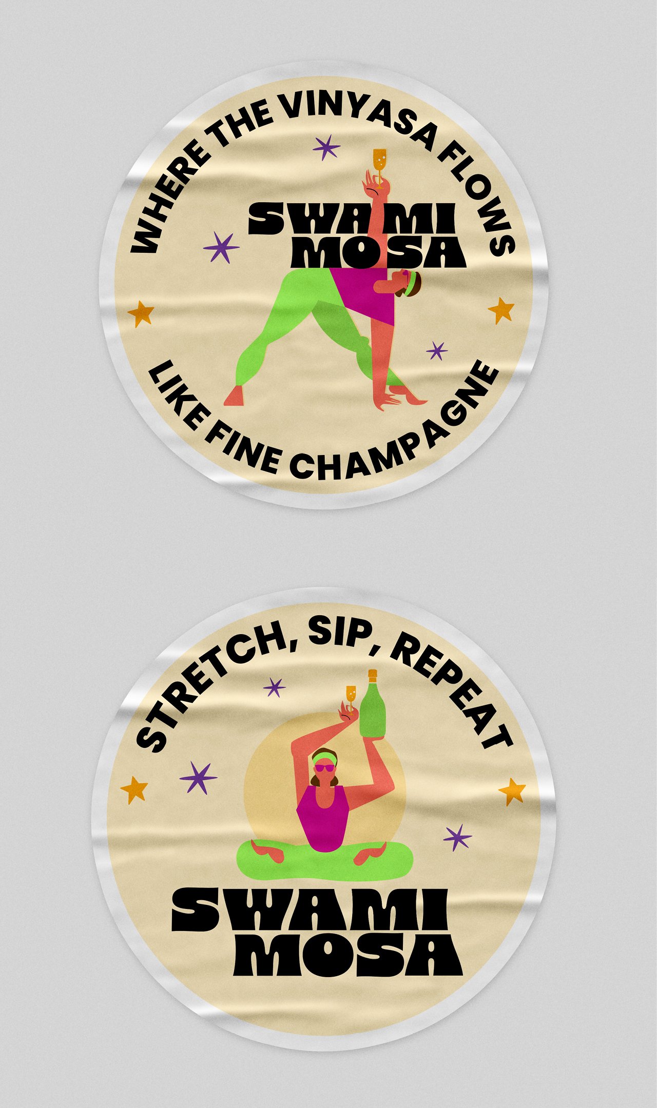
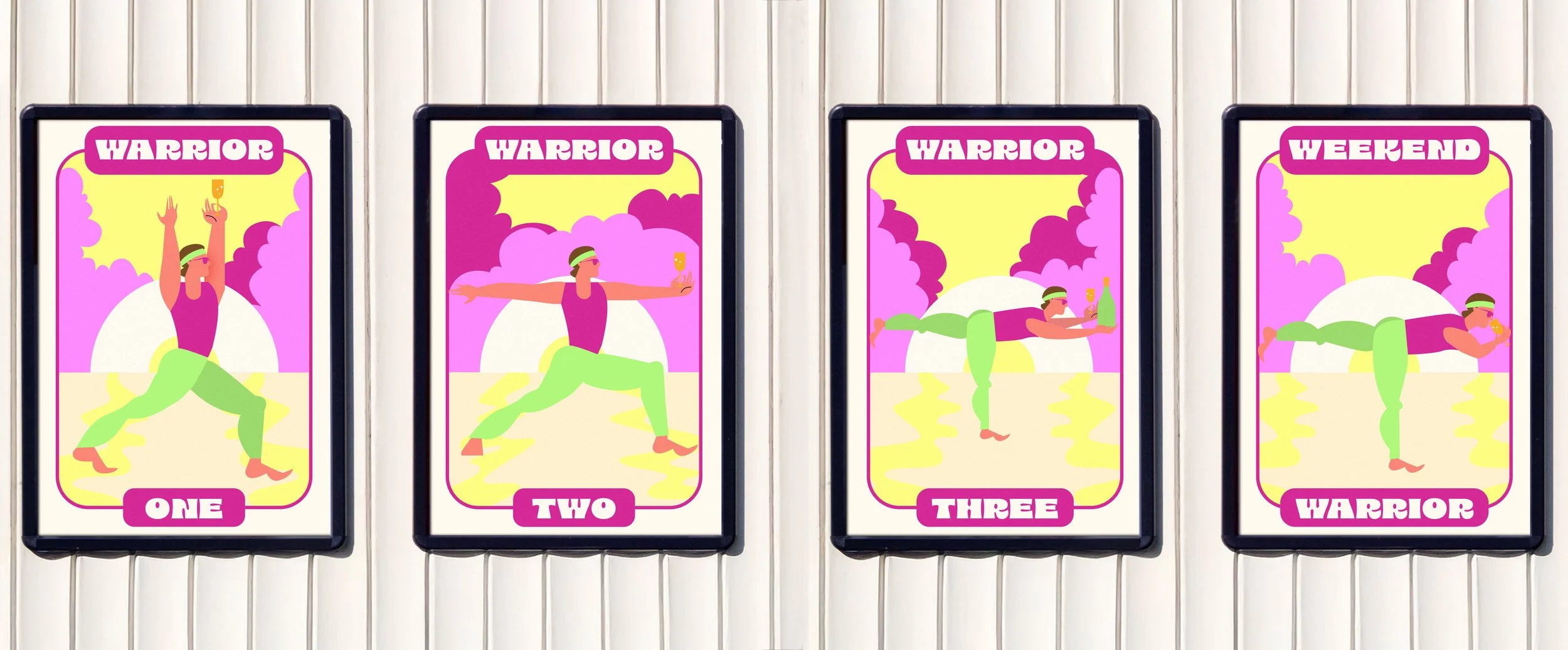
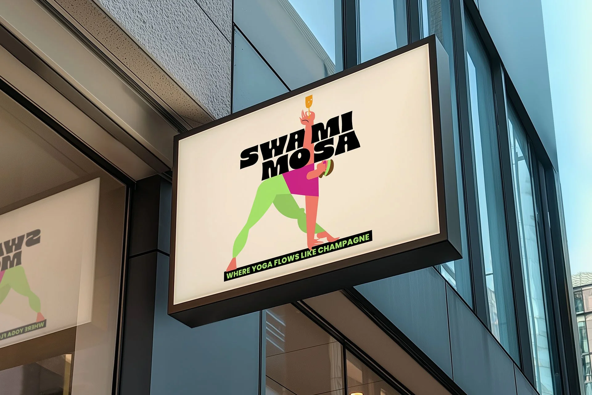
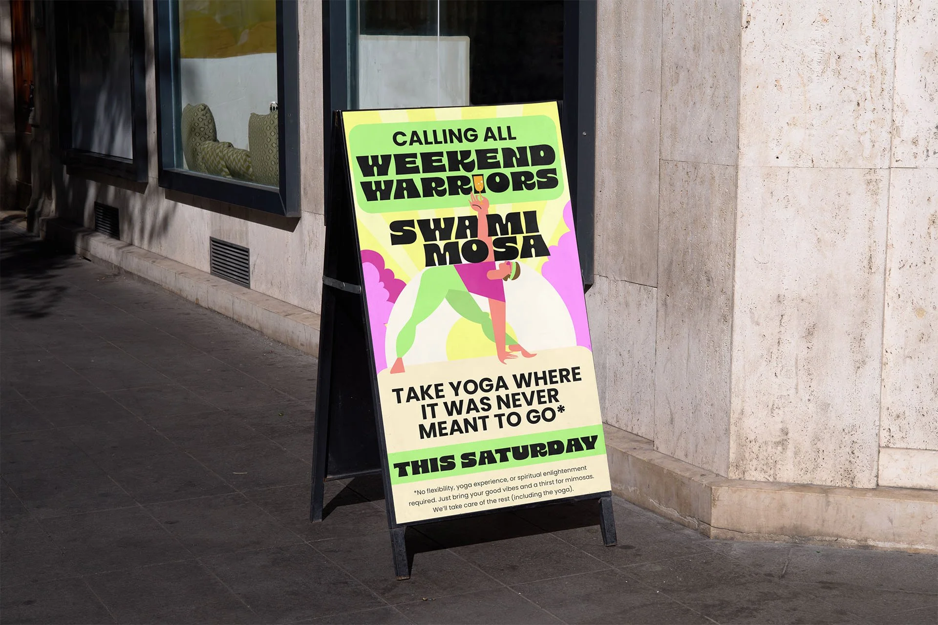
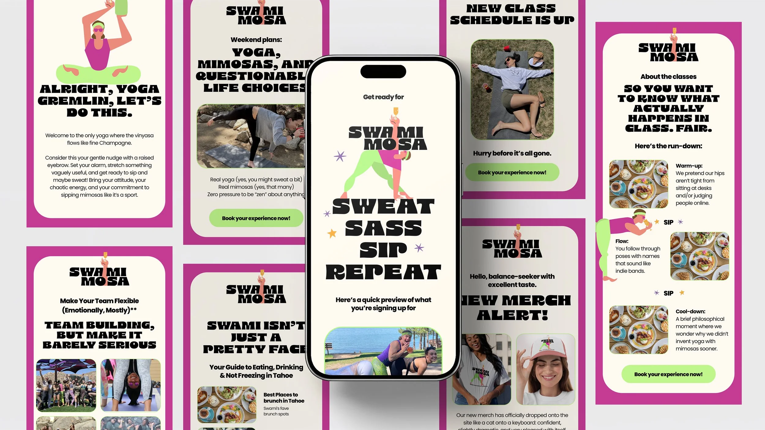
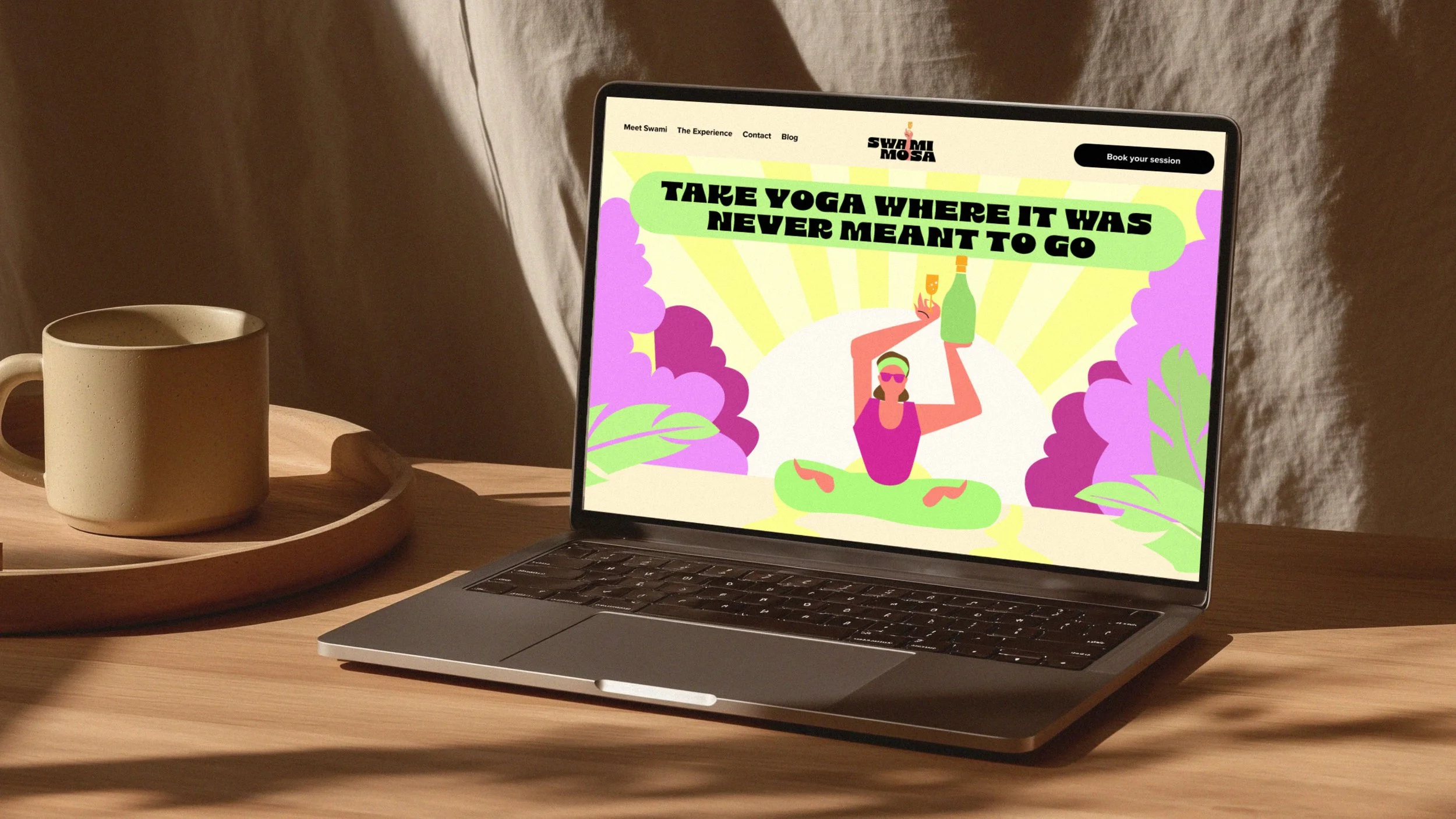
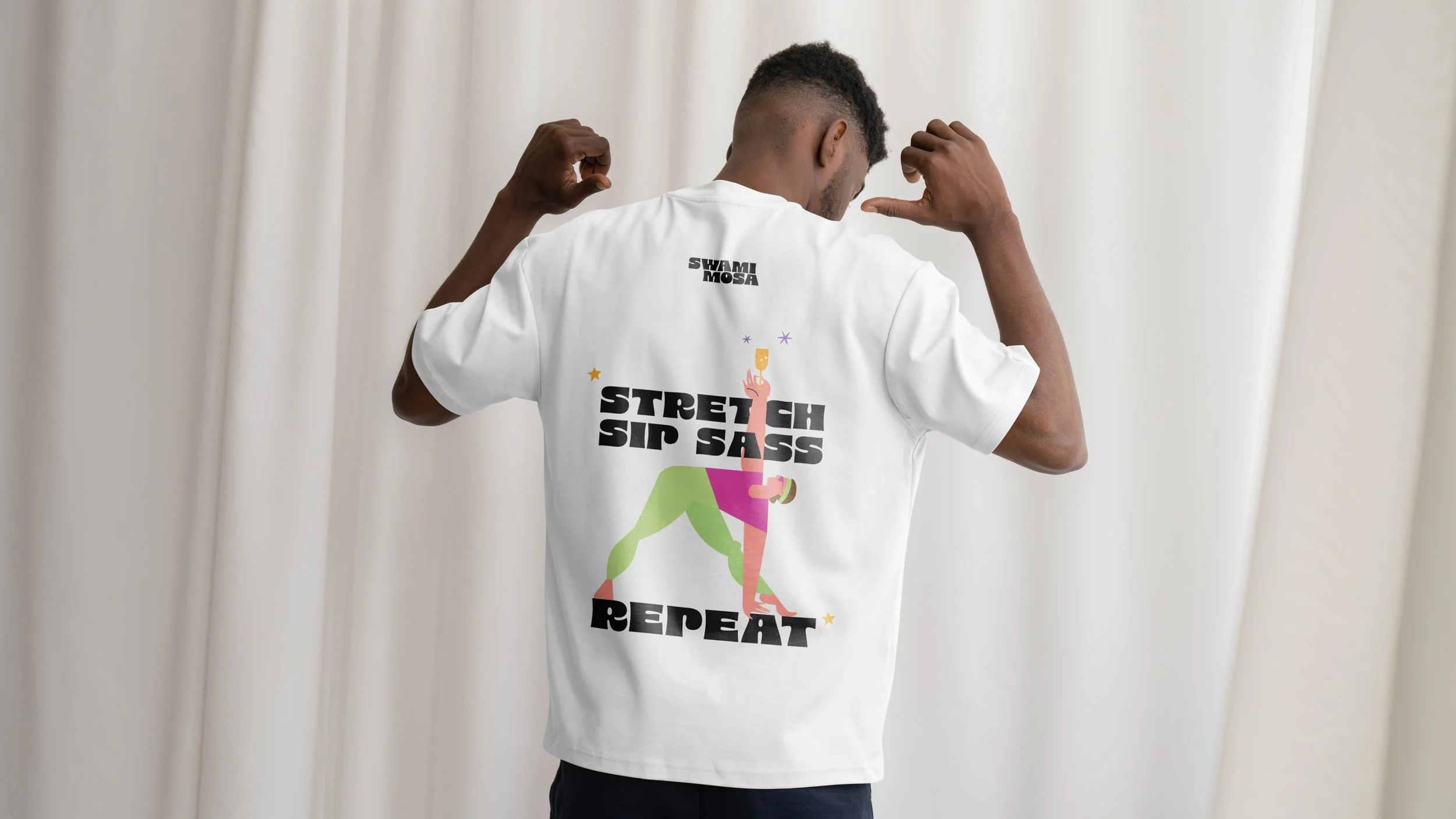
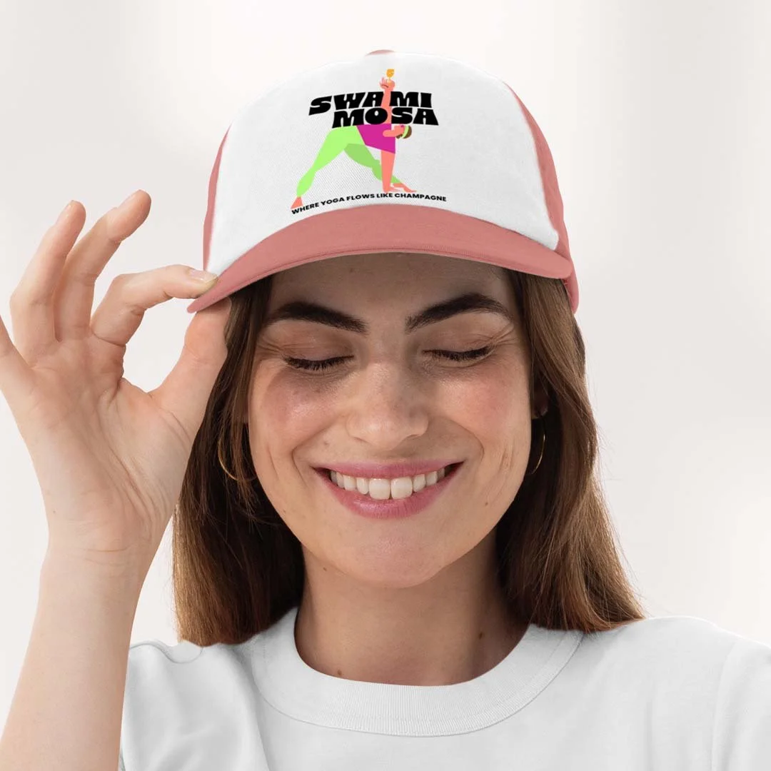
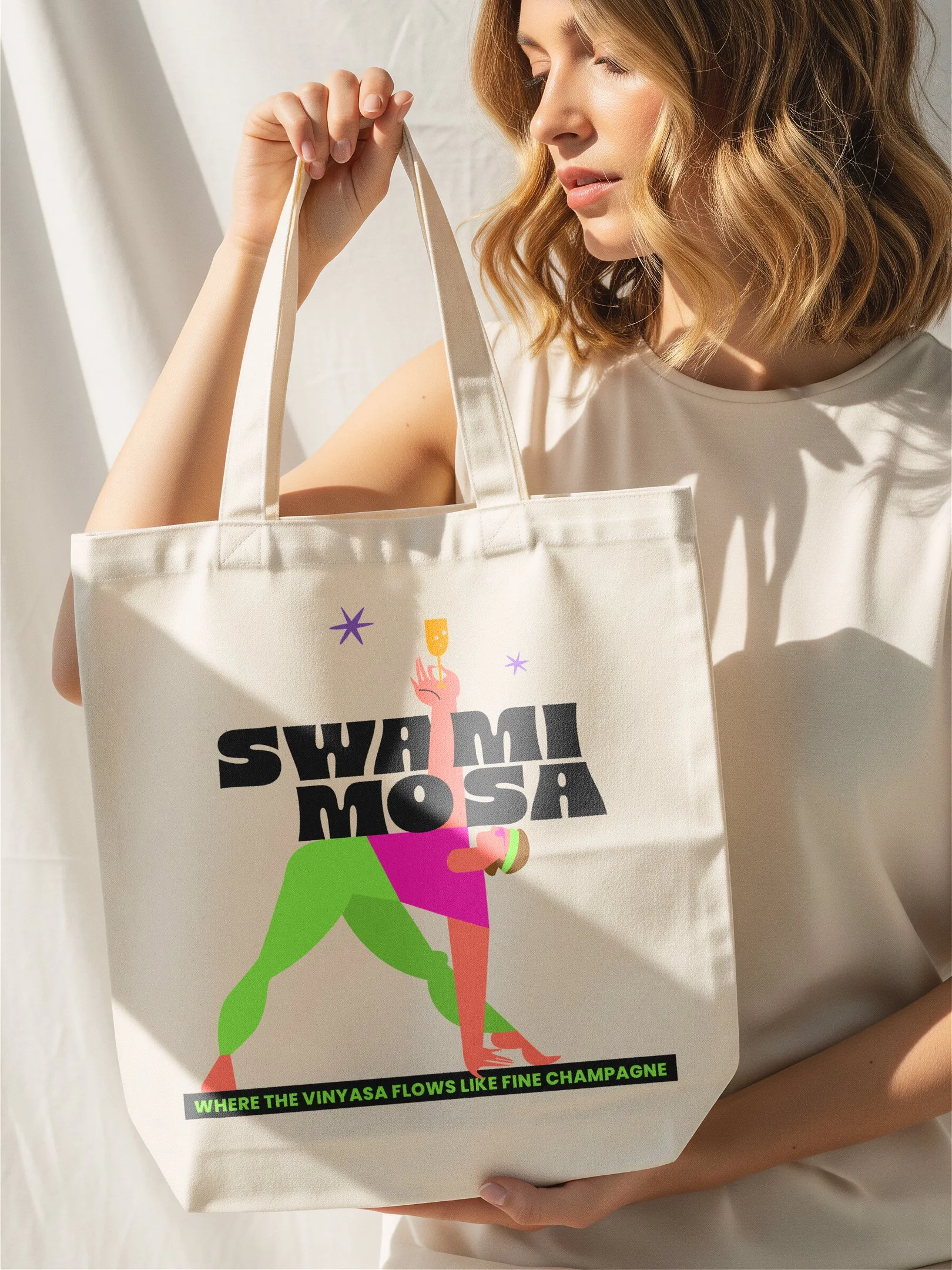
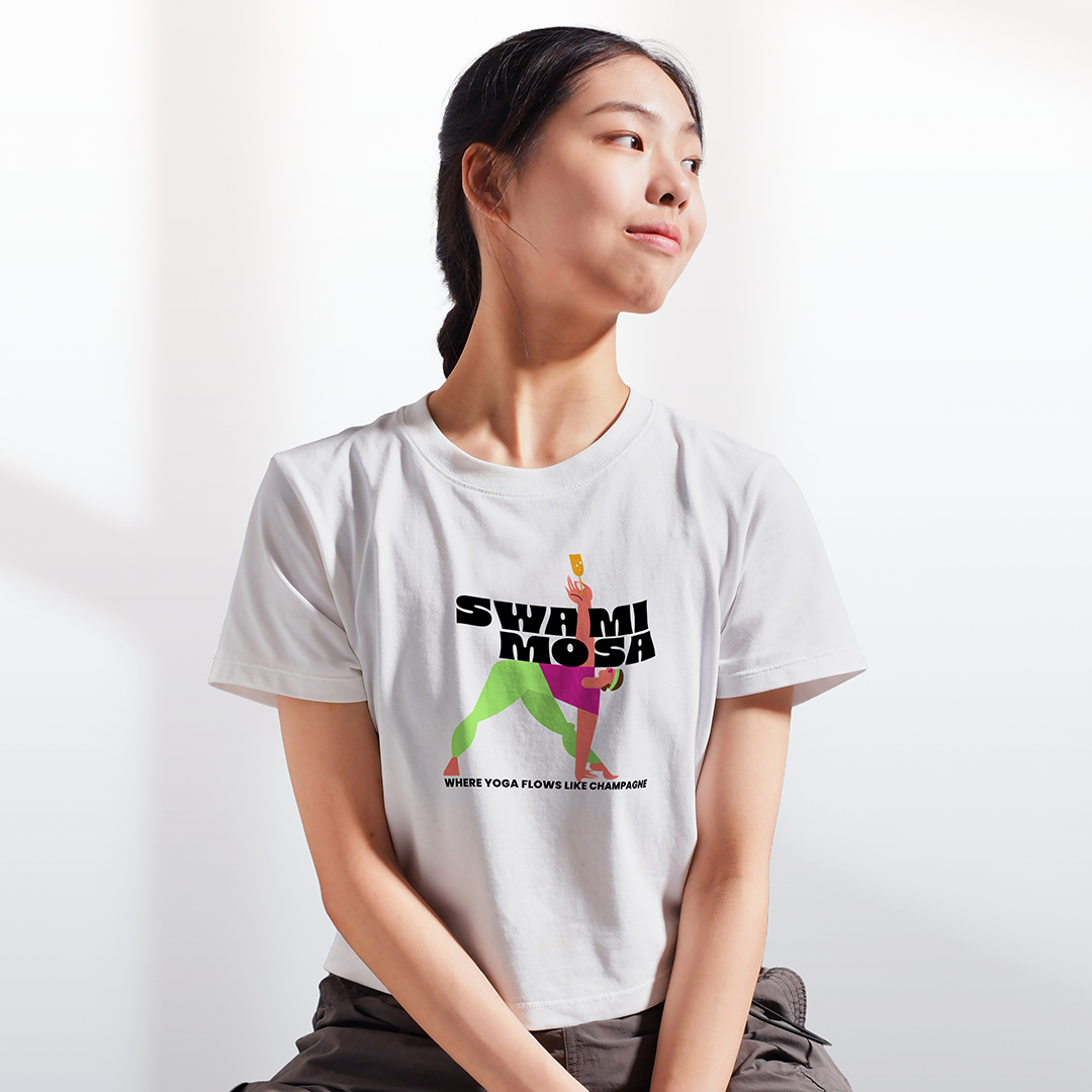
Swami Mosa came to me to create and develop their brand identity and brand system. The brand revolves around the self absorbed Guru, Swami, and the logo is designed to reflect the brand’s fun personality: bold and bright. I created a brand system with a mix of illustration and photography to maintains consistecy in comms and allows for expansion into physical assets such as merch.
-
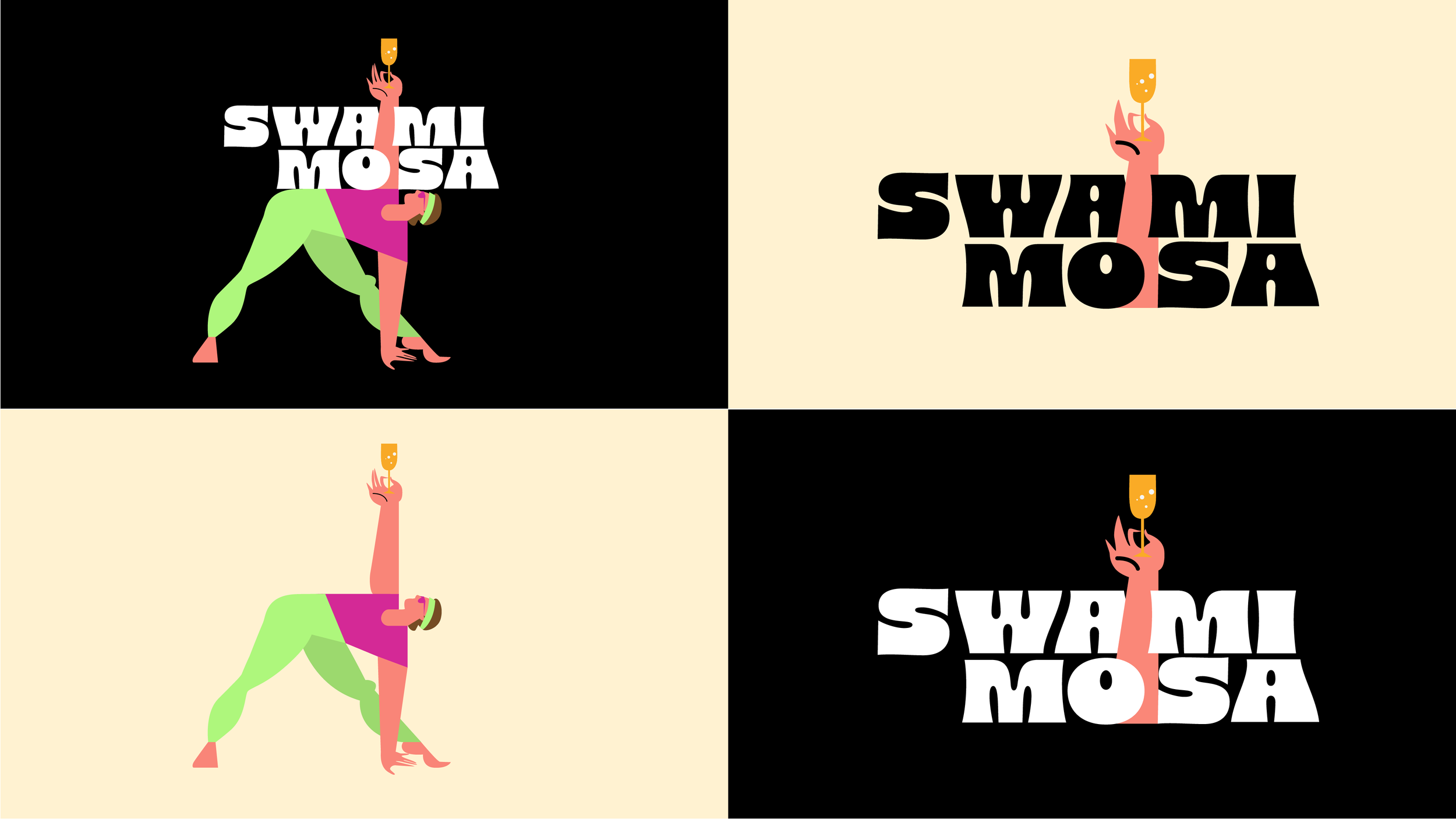
Prior to the rebrand, Swami Mosa had no fixed logo or brand in place. With the guru being the centre of the brand, it was clear that he needed to be featured in every aspect of visual identity. So, we placed him at centre stage, striking a yoga pose with a mimosa in hand in the logo, bringing the perfect mix of mindfulness and fun. The playful illustration and vibrant colours reflect the energy of the experience, while the chunky, retro-style typopgraphy adds to the personality and gives it a confident, feel-good vibe.